Vedic Bio Science Identiy.
Case Study
Prject Description
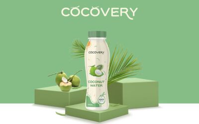
Creating brand identity for a biological research product. The company’s motto is to extract the elements from natural resources and present in a new way to its customers. All the products offered by the company are enriched with natural organic extracts.
The design is a combination of clean and classic illustrations and restricted to a organic color palette. The contrast between logo mark, font and colors creates a highly recognizable and modern look.