Geo Travels Logo & Visual Identity.

Case Study

Prject Description

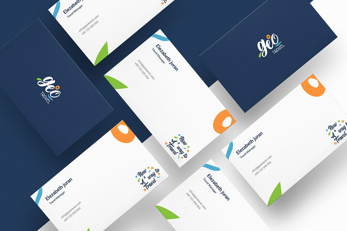
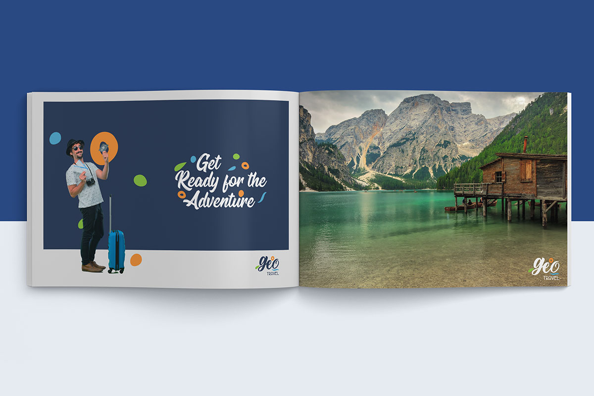
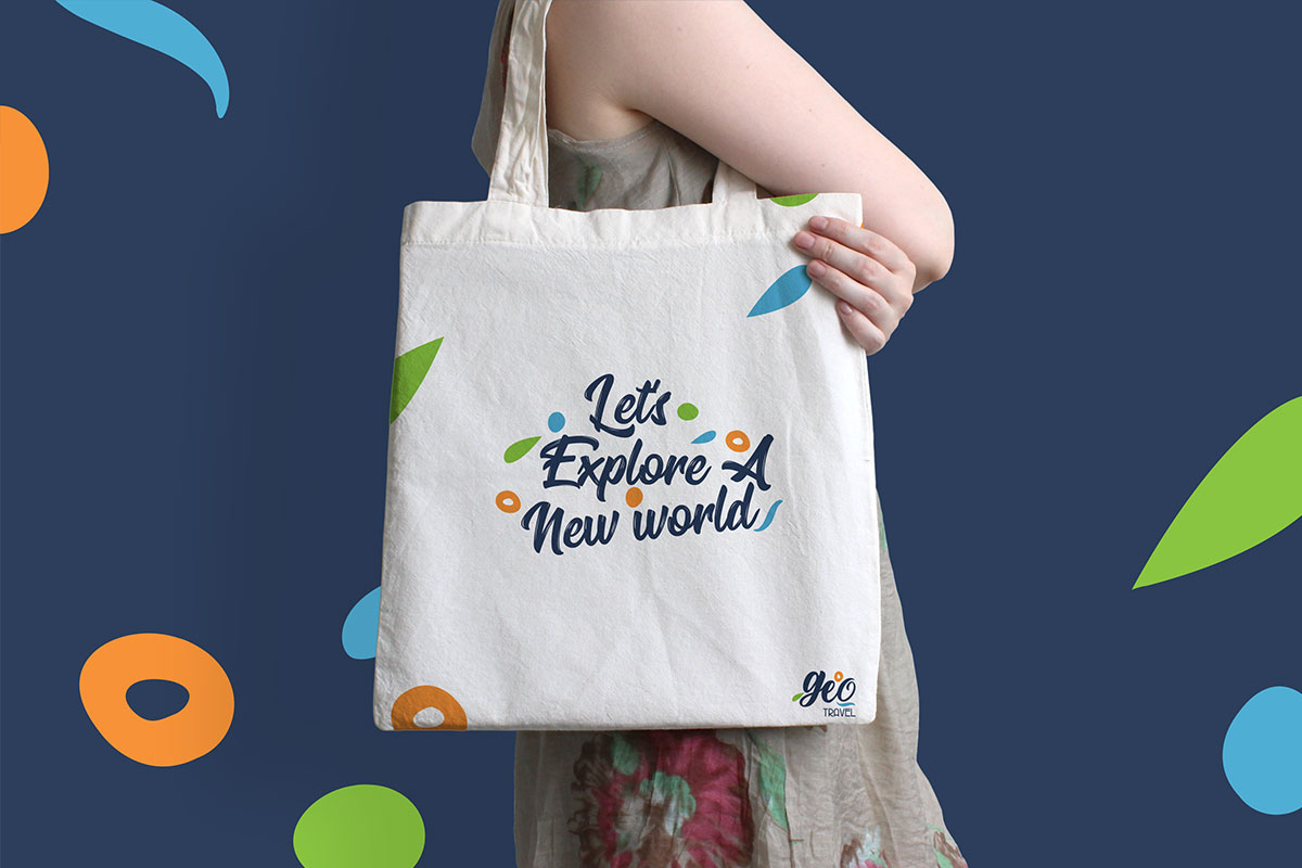
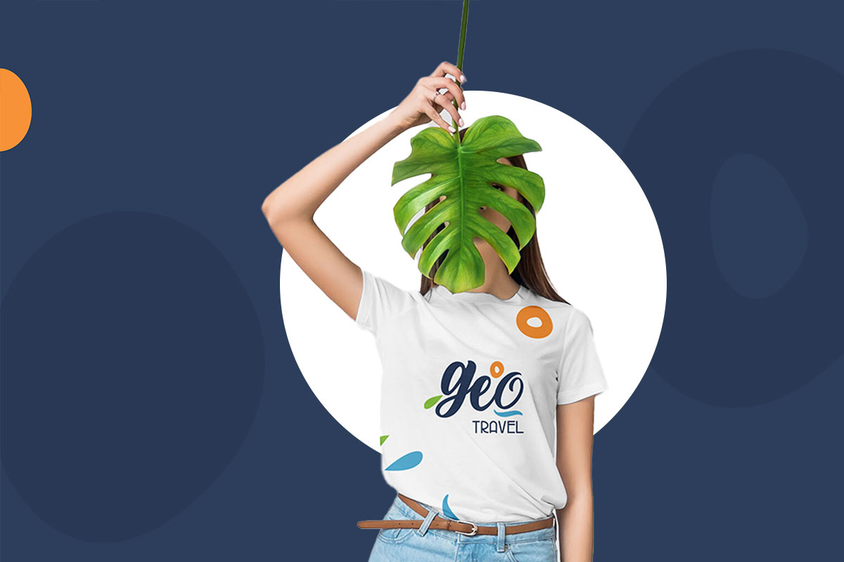
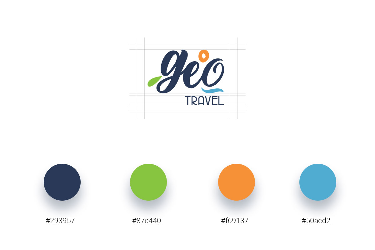
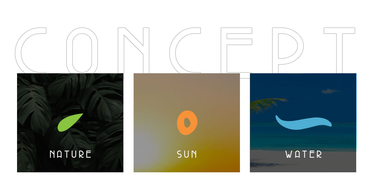
Taking a trip is always fun, relaxing and full of life. It takes us to the lap of nature and allow us to explore life in a new way. Hence the “geo” logo created in such a way to reflect that thought.

The fonts used is informal and playful. The three elements represent Mother nature in its basic form with appropriate color.
Looking to create a brand like this ?

Related Project

Cocovery

Cocovery

Cocovery - Coconut Water Branding & Packaging.Case StudyPrject DescriptionCocovery’s tender coconut water is completely natural with zero chemical and sugar. It is absolutely without any harmful preservatives and tastes exactly like the one that you have just...

Tiffin Box

Tiffin Box

Tiffin Box Identiy & Packaging.Case StudyPrject DescriptionTiffin box provides tasty home cooked meals for the peoples who away from their home and busy working families. The logo is a lettermark based logo with a atributes of playful, fun and vintage look. The...

Pin It on Pinterest